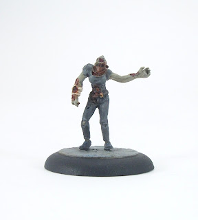
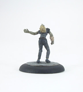
Unlike last week's offering, there appear to be clearer causes of death for this week's Zombie - either a torn out throat or maybe a broken neck. Prior to that, it looks like she was chewed on by walkers for a little while (they seem to have taken small bites rather than going for a full course meal). Either way, she certainly carries a lot of injuries.
The figure is by Studio Miniatures (as have been all the Zombies I have painted this year so far); I found some of the bits of the mini hard to figure out, but overall I do like the sculpt, and the various signs of trauma certainly make it distinctive.
I went for quite a muted palette of colours with the clothing. Then, when all garments and flesh were painted, I liberally applied a mix of Tamiya Clear Red, Vallejo Smoke and Army Painted Strong Tone to areas of wounds etc and where I thought blood would spread. The flesh is my usual recipe of base Vallejo Green Grey, mixing in Burnt Umber for shading and Basic Skin Tone for highlights.
Zomtober 2017 blog roll (click blog names for links):
- Brummie's Wargaming Blog - Simon
- Four Colour Super Minis - Rob
- Eclectic Gentleman Tabletop Gamer - pulpcitizen
- Fantorical - Blaxkleric
- Mike's Random Wargaming Meanderings - Mike C
- Saturday Mornings - Ivor Evans
- 28mm Victorian Warfare - Michael Awdry
- Miniature Mayhem - Terry Silverthorn
- ANYTHING BUT A 1! - Clint
- Cheaphammer!!! - Kieron
- The Wargame Addict - Wargame Addict
- Lead Reckoning - Fred Jackson
- da Gobbo's Grotto - Wargaming blog - da Gobbo Grotto
- Never Mind The Jankers - Roy Williamson
- Paintbrush and Superglue - Matt
- Dizbusters Gaming Ephemera - Phil Curran
- Wargaming With Barks - Barks
- Thoughts of a Depressive Diplomatist - Edwin King
- EndTransmission's gaming stuff - Paul Smith
- Colgar6 and the Infinite Legion of Toy Soldiers - Colgar6
- dead lead project - myincubliss


Hmmm... I think considering the awkwardness of the sculpt's pose, at least from the photos, the muted palette was definitely the way to go, PulpCitizen - as the eye is thus drawn to the gore as resultantly, to the head. I fear that's not a mini a like, but that's nothing to do with your tip-top paint-job :-)
ReplyDeleteThanks Blaxkleric. :)
DeleteIt is definitely an unusual and awkward pose with the head tilted all the way back as it is.
Awesome job dude on a great looking zombie miniature
ReplyDeleteCheers mate. :)
DeleteExcellent. I really like this one.
ReplyDeleteI will be posting my Zombie in the next 30 mins.
Thanks Clint. :)
DeleteThat's actually a really disturbing model as it takes a moment to work out what you are seeing.
ReplyDeleteReally 'nice' work. It's a bit stomach churning.
Thanks Kieron - I am taking stomach churning and disturbing as good things. :)
DeleteLovely job on this shambling sack.
ReplyDeleteGruesome mini and a good paintjob.
ReplyDeleteThanks Zabadak. :)
DeleteBeauty work as always!
ReplyDeleteThanks Michal. :)
DeleteNice! I've been zomtobering as well over at deadleadproject.blogspot.co.uk, and actually managed to get a mini posted ahead of the deadline this week!
ReplyDeleteThanks. :)
DeleteAdded you to the list. :)
That is a pretty nasty looking pose! I do like the bandage on the arm suggesting that there was hope for this woman at one point. Great stuff!
ReplyDeleteThanks Ivor; yes it does seem that for a brief while she had a chance then things turned really bad! :)
DeleteLove it! :-)
ReplyDeleteCracking paint job on a mini that's just gone on my "wanted" list, and another skin tone recipe added to the list!
Thanks Wargame Addict. :)
DeleteI do really like almost all of the Studio Miniatures zombies. :)
She looks like she has had a really bad day.
ReplyDeleteShe does indeed Mike. :)
DeleteAnother bizarre & well painted zombie Pulp! I haven't invested in any Studio Miniatures, but you certainly showcase their range!
ReplyDeleteThanks Terry. :)
DeleteI really love almost all the Studio Miniatures zombies (only a couple of exceptions I don't care for).
Lovely job as always
ReplyDeleteThanks very much Phil. :)
DeleteLooks up to your usual high standards, nice work.
ReplyDeleteThanks Fred. :)
DeleteYou are right, the figurine takes a while to figure out. But that's the sculpture and not your paint job. You did a good job here.
ReplyDeleteThanks very much FourEyedMonster. It is certainly an unusual sculpt with the usual focal point of the face being tilted backwards. :)
Delete